Self branding is an important step in any designer's life and one I really desired to perfect in a manner that represented me and who I am.
Self Branding
When designing my logo, I wanted to represent myself,
my passions, and my interests in a single shape, and I believe the crescent fox does that. The swoop stands for the flow
of my loose drawing style, and it also resembles a crescent moon, representing my birth. The fox reflects mischief
and curiosity, two qualities I tend to show. The typeface
beside it, Ruwudu, is a serif that reflects how I try to present my art, and it complements the swooping mark well.
The process
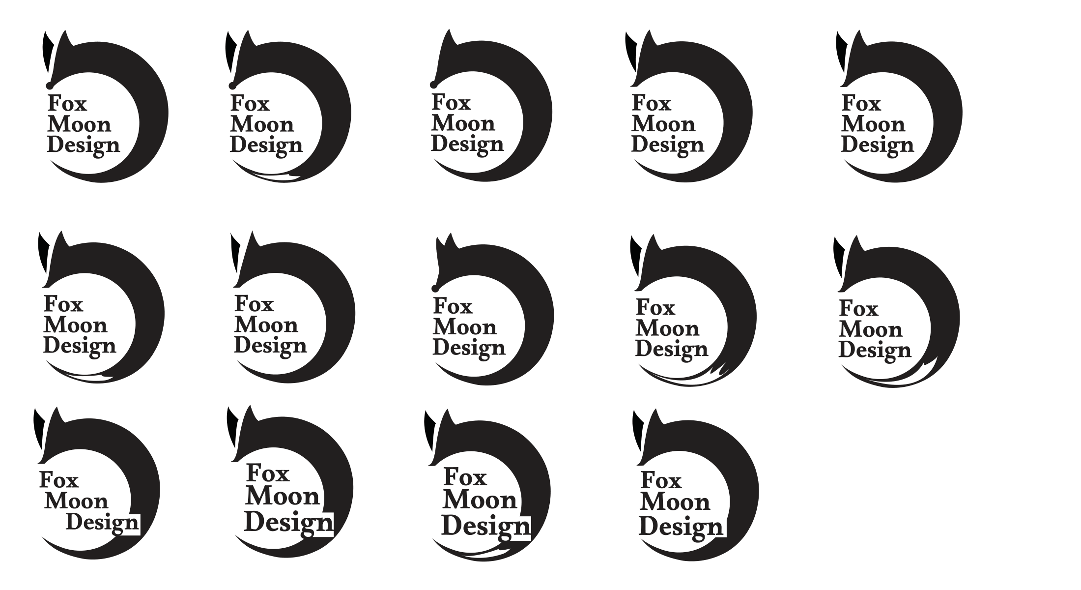
When determining a design after countless sketch iterations,
I landed on the swoop idea, yet had no set design
on how it should look. The iterations you see are just
a few of the many concepts that were applied on the layout.
Finalizing
When I landed on the fox swoop, I think one reason it stood out among the others is how it felt new. Now I know a swoop
with a fox isn't entirely new, but the combination and feeling
the final product looks I felt stood out strongly to me.
The goal
The mark should be recognizable from multiple distances and still feel the same.
Tools: Pencil, Illustrator
Other ideas I considered
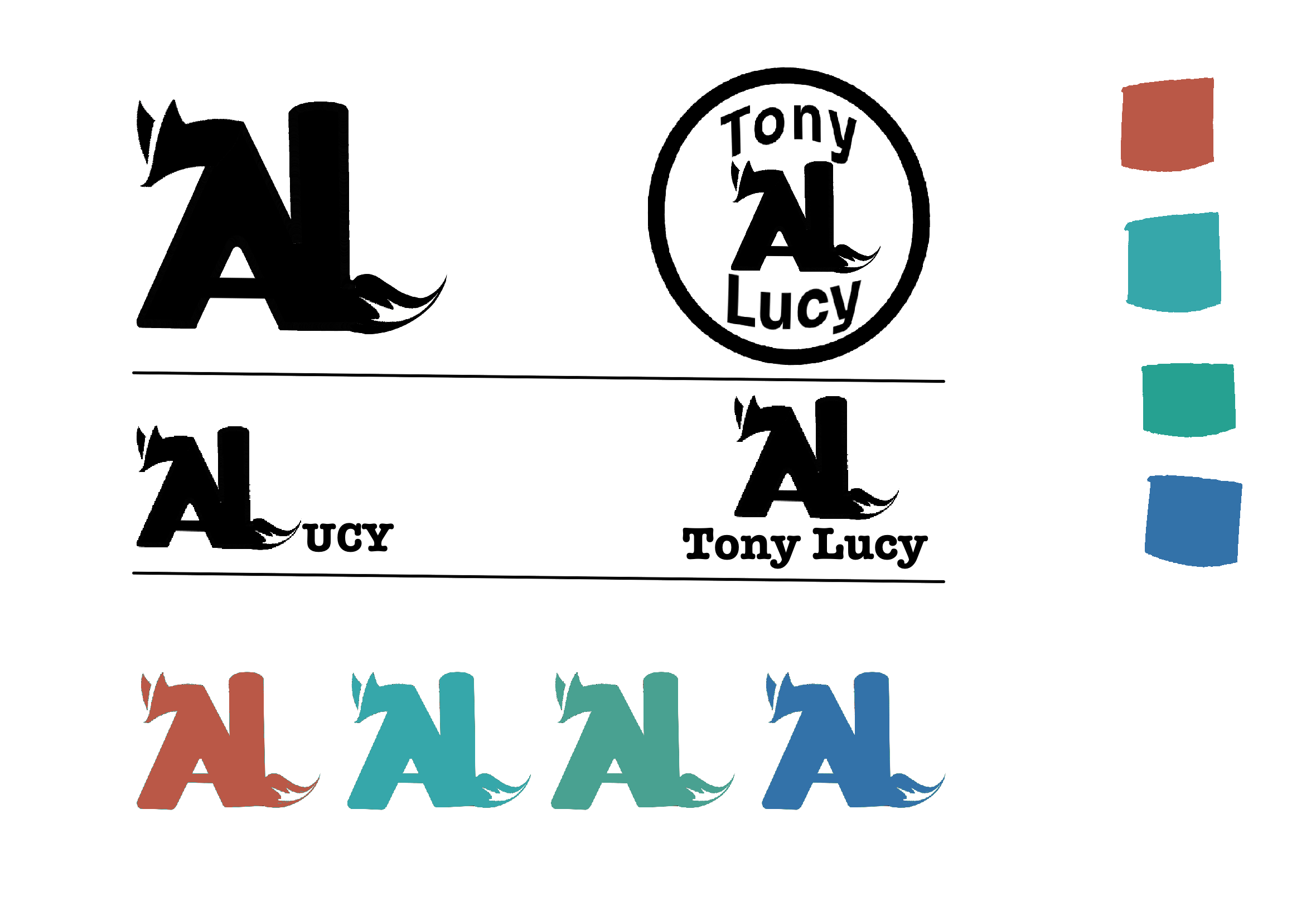
either end. Felt too bland and simple.
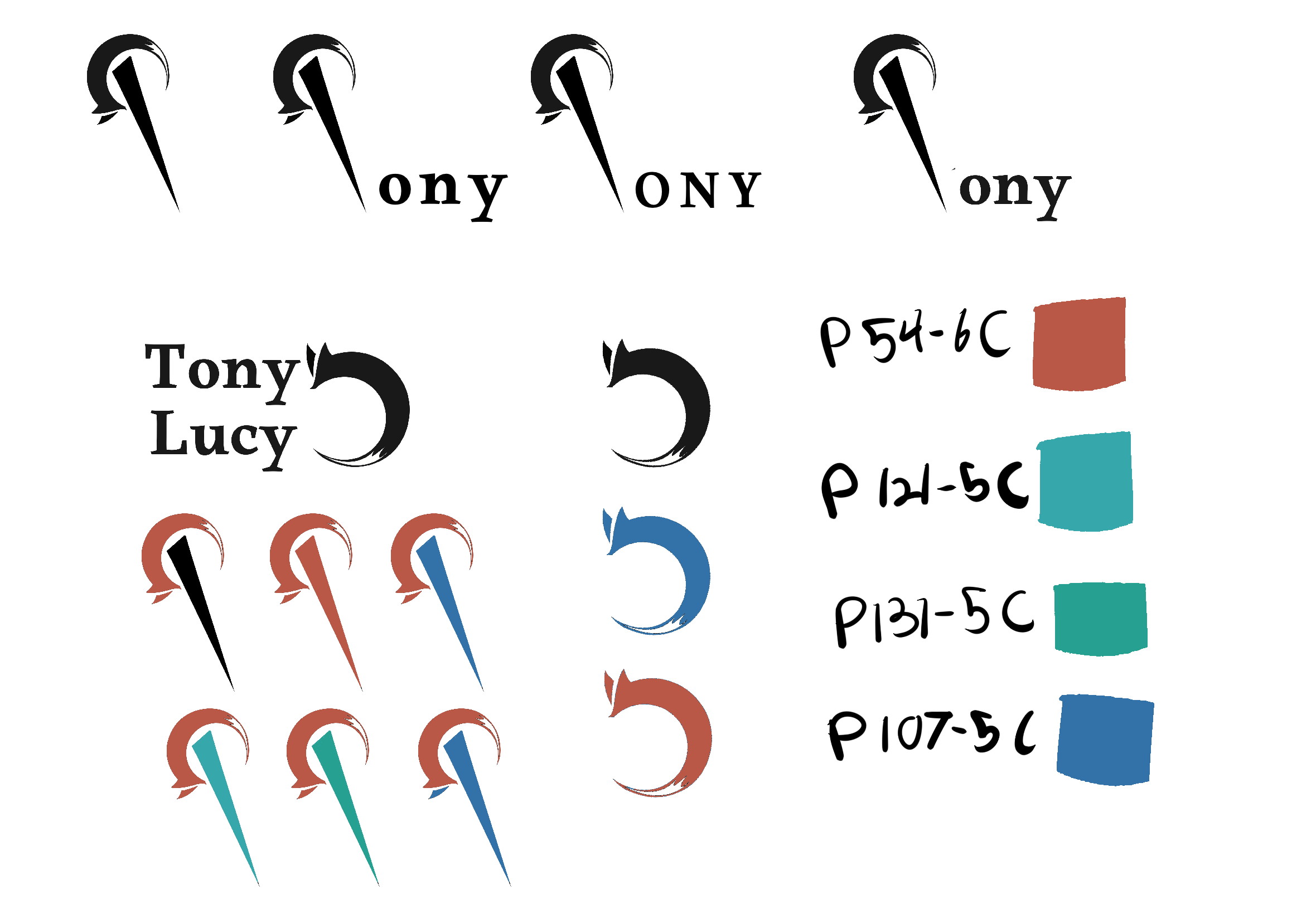
had too many interpretations and did not translate well.